RagPiano.com - Guide to Ragtime Era Sheet Music
Sheet Music Cover Art History
An Essay on the Historic Role of Sheet Music Cover Art
by Bill Edwards:
Contents Copyright ©2001/2004/2015 by William G. Edwards
As the old saying goes, "You can't judge a book by its cover." However, the better the cover it has, the better of an idea you will have of what is supposedly contained in that book. The same goes for sheet music, although it was not always so. Whether it is right or wrong, good or bad, it is a fact that many, perhaps most sighted human beings respond positively to visual stimuli that they find appealing. This applies to food, partners, cars, toys, etc. Those who have been marketing consumer products over the last century have figured that out and often admitted it. The process of selling something through visual appeal developed nearly equally in sheet music and advertising near the end of the nineteenth century. This article will explore facets of the explosion of sheet music cover art in the early twentieth century, including some of the artists, processes, themes, and social ethics involved. There are only a few examples presented here. Places to explore more cover art are presented at the end of the article, as well as on the
links page in this section.
 there was the word, and the word was with letters, and the letters constituted text, and the text identified the contents within. Then the publisher said "Let there be art," and it was so. And the public saw that it was good, and they said that it was good, and they bought it because they knew it was good. |
Actually, it wasn't quite THAT simple, but that paraphrased synopsis is not too far off from the truth. Music publishing in America got its fledgling start in the 1790s, and was a thriving, though not lucrative business by the 1810s.
An early edition of the Star Spangled Banner. The first full edition contained only the music without the lyrics. |
There were a number of reasons for this, many of which are discussed in a separate article about
Ragtime and the Economy. In short, expansionism to the American west was still in the early stages, railroads and convenient methods of shipping were not yet a reality, and the average consumer did not own a piano. As a result, music publishing was primarily a regional business, augmented by imports from Europe. Also, printing presses were very much in demand for newspapers and magazines, and a difficult to obtain commodity in pre-industrial years. Just the same, since there was only a limited market for printed music, marketing it was much less of a concern. Many publishers were happy to sell anything, and they believed that the demand for their music should be fueled by the music itself, not the package in which it was contained.
As early as the 1840s there were the occasional colorful lithographs for commemorative or special occasion music, but these were very much the expensive exception, with chromolithography largely reserved for formal artwork and commemorative pieces. Although it was still in its infancy in the 1840s, limited reproduction of fine color artwork was a still a reality. The art used for both American and British sheet music was, in some cases, something commercially available for a variety of purposes or themes, and could easily be reused for many different titles. In fact, many of the early lithographs and chromolithographs were based on established traditional artworks.Throughout the 1840s and 1850s the costs involved with printing colorful artwork often outweighed the benefits, so at best many sheet music covers with any art at all on them presented the graphic in a single color and the text in black. The graphics were either woodcuts or basic lithographs. For some shops the primary method for coloring was by hand, although this was usually done on larger commercial lithographic pieces rather than on sheet music.
Shortly after the end of the Civil War, the United States started catching up with Great Britain and Europe
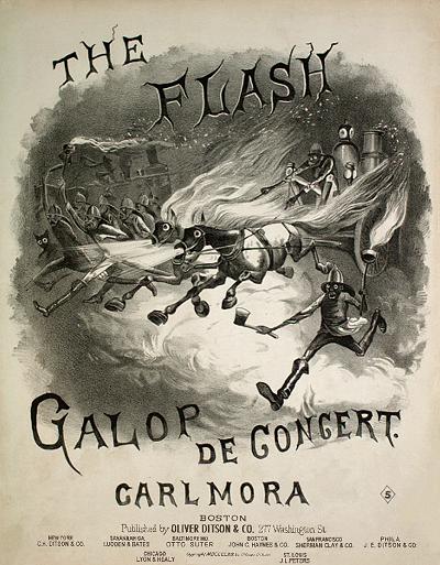
A stereotype laden image
adorns the Flash, depicting
a race to put out a fire. |
in the quality of sheet music printing, lithography techniques and the orginality and variety of cover art. Many pieces had artwork designed specifically to reflect the contents of the music, ranging from classically styled portraits to those depicting comic stereotype, as shown on the right. A leader in music publishing, distribution, and cover design at this time was the
Oliver Ditson Company, which was based in Boston and had branches throughout the major United States cities. They were among the first to introduce widespread uniform distribution of certain pieces while maintaining others within their locality, and early form of judicious marketing. The use of illustrated covers, which were in line with other publications of the post-Civil War era, was a conscious effort to facilitate sales.
The American buying public became more prosperous through the decades of the 1870s and 1880s. The gradual progression of the population in the East from rural to urban life soon took hold, as well as a large influx of immigrants into the cities. The children of long-established farmers in the East were less likely to inherit a piece of land from their parents since so much of it was already utilized. So they became miners, bankers, storekeepers, traveling salesmen or businessmen. Musicians remained musicians, but there was increased demand for their services. As career paths and work patterns changed, so did the amount of leisure time for the average family. All of this meant more customers with pianos or some other instrument, some extra spending money, and the time to enjoy their purchases. There were an enterprising few in fledgling leisure-based lines of work that soon found how to take advantage of this.
In the 1880s consumers in the Western world started responding to certain pieces that had appealing cover art, something that many publishers took note of. Over the next decade publishers would continue to increase their efforts to create appealing covers, regardless of the contents of the piece, often resulting in disastrous financial consequences, and frequently perpetuating offensive stereotypes. In essence, the sheet music industry was slowly joining, to some extent, the advertising industry in terms of marketing their product. But at some point publishers started to create works of lasting value, both musically and visually. By the end of the nineteenth century only one of those publishers would stand head and shoulders above the rest in regards to sheet music cover art and the power of marketing.
Let us break away for a minute to discuss the printing process. Much as with computer publishing programs of the 21
st century,
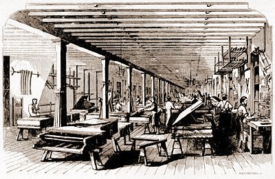
A woodcut of the Steinway Factory in 1860 from Frank Leslie's Illustrated Newspaper. |
there were two major elements of page composition in the nineteenth century. Those are, of course, text and graphics. In a sense, text is a graphic of sorts, since each letter is essentially a picture, one that varies from one font-face to another. The text was often assembled from leads, which were individual letters made from the soft metal that gave them their name. Letter designers created a variety of font faces and sizes, and many publishers employed such designers, while others bought up letters from contractors or by mail order. In the case of music publishing, the use of typesetting leads made less sense because the need for frequent alteration of lettering was not the same as for a newspaper or magazine. So many publishers opted to create plates of wood or metal with the letters integrated permanently into the plate.
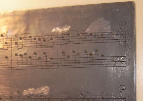
As for producing the music, which was a bit different than text, negative image engravings were made from zinc or pewter. To create the staff lines the engraver dragged a five pin scoring tool of appropriate size across the plate for each stave. The notes, accidentals, clefs, text, etc. were then punched in using dies in the proper shape.
An example of an engraved
sheet music plate |
Some of the plate elements had to be drawn manually with varying sized points, such as slurs, beams and arpeggios. While it was not necessary that an engraver should read music, it was obviously a useful if not essential skill.
One advantage of engraving in terms of recycling, which was also at times a detriment for posterity, was that after a run of a designated number of copies (supposedly all that would ever be needed), the malleable plates could be melted and reused. This led to the unfortunate disposition of many pieces of music which were permanently lost to all but a few. Movable type for music was tried at times, but the difficulties of merging the symbols and staff lines resulted in questionable quality of the finished product, so the method was abandoned as engraving became more universal.
A similar engraving process was often used for covers. The illustrations were frequently integrated into the same plate as the title text, but on many occasions, they were contained on a separate wood cut or lead relief. The craftsmen who produced illustrations in this medium were greatly skilled not only at creating art, but in the process of working with sharp cutting instruments and keeping them sharp. Some would even create the entire cover plate from wood or soft metal using these processes. But the amount of time required to create such drawings, as exquisite and detailed as they were, often made this an expensive endeavor. The reproduction of half tones had to be done through careful dithering or shifting line densities, with mixed results. Fortunately, the process of lithography came along, allowing art and music to effectively merge.
The etymology of lithography, first used around 1813, goes back to the Greek word for "stone drawing." It is as much science as it is art. Introduced in 1798 by
Alois Senefelder as part of an attempt to mass-produce printed articles and scripts at low cost,
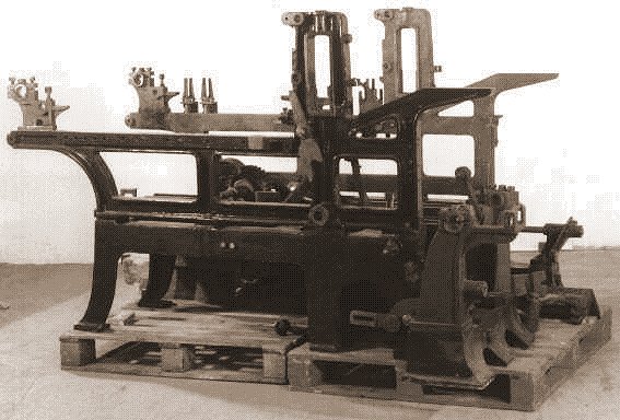
A typical late 19th century stone
lithography press. |
it was an important advance in printing for the 19
th century. The inventor actually discovered the process accidentally when writing, of all things, a shopping list on a flooring stone with dried tallow ink. When the greasy ink did not come off with water he found that it could be used to make an impression on paper, since wet ink would not stick to the stone but would stick to the grease.
An image is initially created on a flat piece of limestone using some sort of greasy or waxy drawing utensil, such as a pastel stick, grease pen, graphite pencil, etc. The stone usually has varying degrees of fine grit on it to help the grease stick to it. Then the stone is dampened with water and ink is applied to it with a roller. The water is important in that it is repelled by the grease or wax of the image and carries away some of the ink. The remainder of the ink adheres or is absorbed into the drawing material. In many cases there are chemical treatments which further etch into the bare stone without affecting the grease, providing more relief for the drawing. The stone is then readied for press. Early lithographic transfer meant overlaying the paper on top of the stone with more layers of paper on top if it to act as a cushion. The layers are covered with metal, and pressure is applied to the metal by a large scraper, designed to press down on only one thin line as it moves across the plate, minimizing ink bleeding.
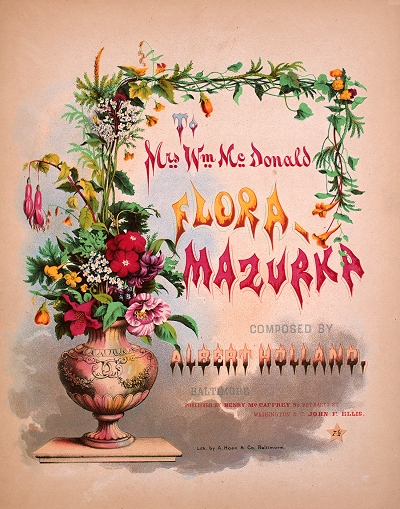
The colorful Flora Mazurka cover engraved by A. Hoen in Baltimore, Maryland, 1861. |
The ink is then transferred from the grease to the paper. The end result is a negative of the original drawing.
Color lithography, also known as chromolithography, was introduced around 1835. It uses the same process, but in a more complex manner. The lithographer needs to be able to create color separations, where one stone contains the outline of a drawing, and two or more stones are used to apply the colored ink where appropriate. Lithographic color inks were somewhat transparent, facilitating the process of creating varying hues through layering. Since it was difficult to mix the inks from different plates while still wet, the order in which the colors were applied made a significant difference in some cases. For example, blue ink applied over yellow ink would become blue with a hint of green because it was more opaque due to the color density. Yellow ink applied over blue ink would create a very satisfying green since it was more transparent. The quality and whiteness of the paper also strongly affected the final ink color. There were also issues of how to maintain alignment between each stone to minimize color bleeding. So the process of creating anywhere from two to thirty stones to match and create effective color combinations with minimal offset error could prove to be a daunting task.
In some cases the original artist was also the lithographer. More often than not, however, the lithographer was copying an image from an artwork created by a commissioned or staff artist, or pulled from an established drawing or painting. When creating a chromolithograph from a monochrome drawing, the lithographer also had to make decisions on how to apply color and shading to the image without overwhelming the original artwork. This often required a subtle use of the color palette so as to not detract from the subject with anomalies or blotchy artifacts.
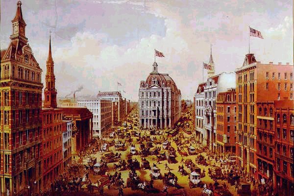
A Currier and Ives print of Broadway, New York City from 1875. |
Among the most effective artists using chromolithography in the 19th century were
Nathaniel Currier and
James Merritt Ives. Currier had actually done work on some sheet music covers as early as the 1830s while still an apprentice. Once he was partnered with Ives they chronicled many facets of American life in a long series of well-designed drawings. Contrary to what many people realize is that most of their drawings from the 1850s to the 1880s were actually black lithographs containing the lines and the shading. The colors were manually applied by contract workers, introducing variances between otherwise identical drawings.
When chromolithography became more refined in the 1880s, many companies specialized primarily in this process, such as the A. Hoen Company of Richmond, Virginia, which would eventually play a major role in sheet music cover art for the E.T. Paull Company. Music publishers would contract such firms to print and often design artwork to their specifications, and then the publisher would complete the process of adding text advertisements and the music plates in their own facilities. As this became somewhat of a corporate effort by the early 20th century, many fine artists who were also "company men" that worked for lithographers, but did not work on the actual stones, had their efforts live on while their names slipped into obscurity as their work was often not signed. Aside from sheet music and advertising, some of the most colorful lithographs ever produced appeared on highly collectible cigar boxes and calendars.
Later lithographic advances in from the late 19th century on led to photographic lithography processes and offset printing. They still use the same basic principles as stone lithography, but the amount of effort was reduced while the speed and quantity of output has exponentially increased. But for fine artworks, limited edition stone lithographs are still preferred as they present the best color vibrancy and finest detail for large prints. Many of the best sheet music covers from the 1890s through the 1920s reflect this very fact as they retain those qualities a century or more after their creation.
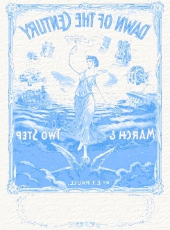
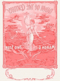
The images below represent the various stages of a sheet music cover lithograph, starting with the color separation stones and showing various blends of color overlay. The images are meant to emulate the original stones, but are only facsimiles, so the colors are not completely accurate.
 Blue or Cyan Stone |  Red or Maroon Stone |  Yellow Stone |  Black or Monochrome Stone |
 Red layered on Yellow |  Blue layered on Red and Yellow |  Black applied over Color image. |
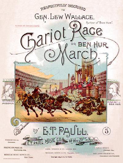
Ben Hur races Masala on the colorful cover of this early E.T. Paull composition. |
It was inevitable that sheet music, a product printed on paper with a need for self-advertising, would meet up with both lithography and commercial artists. While custom-designed art started appearing with more frequency on covers of the 1880s, color art a bit less frequently, there is one composer/publisher who is acknowledged as the composer and publisher of music with some of the most eye-catching cover art ever printed.
Edward Taylor Paull (1857-1924) had earlier failed in a piano and organ business in his native Virginia, but by 1890 had established himself as manager of a similar business in Richmond. Paull had some compositional skills and had published a couple of songs by 1893. Likely inspired by the recently published novel
Ben Hur - A Tale of the Christ by
General Lew Wallace, he composed a descriptive piano march depicting what remains as one of the most exciting chapters of the story, the chariot race. Not content to let the composition stand simply on its own merit, he took the extra step of commissioning a colorful lithograph for the cover from
A. Hoen & Company in Richmond. Thus it was that
The Chariot Race or
Ben Hur March was released by the Richmond Music Company, launching a series of more than 200 pieces with instantly collectible artwork advertising its presence. Both the topic and the cover appealed to the music-buying public and this piece remained in the Paull catalog through many company moves and varying incarnations of the Paull logo at the bottom. The success of
Ben Hur led to a number of other marches in a similar vein, the most famous of them being
The Burning of Rome in 1903, many with even more impressive covers. Most of them were produced with a four color process on high quality paper, and the images are still vibrant a century or more later.
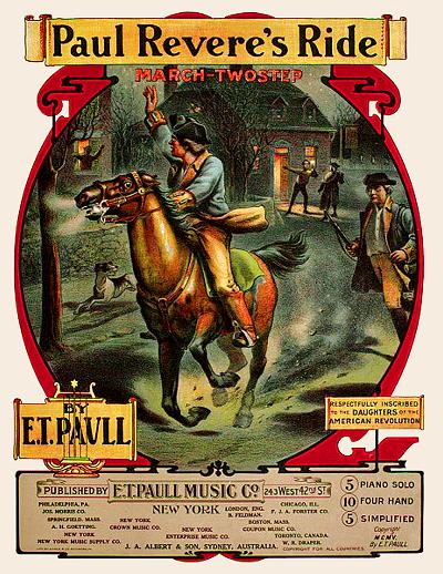
Paul Revere makes his fabled midnight ride on a typical E.T. Paull cover. |
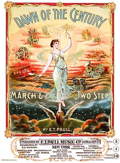
Much of E.T. Paull's 30 years of success had less to do with the content of his pieces than it did with the topics he chose and the covers designed for them. For the most part his marches were similar in style and well within range of the average pianist's capabilities. Many included descriptive text both to describe what is depicted on the cover and for certain cues within the music. Many other composers benefited from inclusion in this catalog with the highly-recognizable E.T. Paull logo at the bottom, as he established his own company late in 1894. After a permanent move to New York City Paull continued to rely primarily on the Hoen company for cover lithography.
As a testament to the difficulties encountered by lithography shops in terms of consistency over a number of years, there are many variations on some of the covers that include some differences in the pictures themselves, varying color schemes, monochrome representations printed in black or another color, and even items that were redesigned, cropped or reduced for smaller sheet sizes. Many of the variances can be viewed at the
E.T. Paull Sheet Music site hosted by Joe Feenstra. It was also Paull's flair for anticipating the public's taste that helped decide which topics to write a march for, and many of them, including wars, disasters, historical figures and the like, also suggested art that often transcended the well-described pieces inside. Unfortunately, through the passage of time the names of many of the individual artists who contributed to this series of worthy illustrations have been lost as they were simply employees of the lithography shop. As a whole their significant contribution to sheet music sales and the artistic trends that followed should not be underestimated. More covers may be viewed on my
E.T. Paull page.
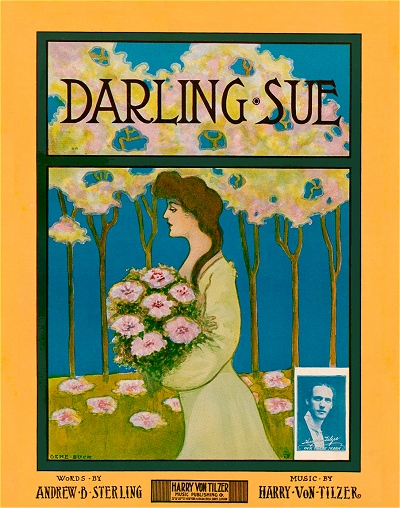
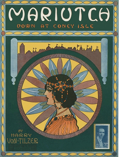
The history, process and purpose of cover art was clearly stated in an article by artist and composer Gene Buck in the March 14, 1908 edition of the Music Trade Review. While it inexplicably leaves out the Hoen artwork found on E.T. Paull covers, it is otherwise fairly accurate in its summary. Color images of the original sheets have replaced those shown in the article in monochrome.
The Evolution of the Title Page
For the benefit of those of my readers who imagine that I may be a gray-bearded old man delving into the records of a misty past, the "Man on the Street" insisted that my photograph should grace—or disgrace—the following record, which he suggested I write for The Review readers, whose knowledge of title pages necessarily begins and ends with the selling quality of the song, which is inserted within. Having made this apology, I will proceed with my subject.
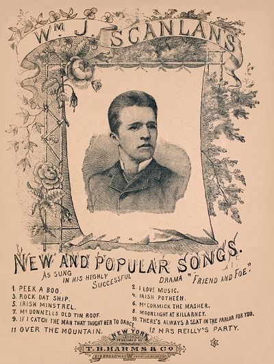
TITLE PAGE OF TEN YEARS AGO |
LINE TITLE PAGE OF TODAY |
At the outset, let it be clearly understood that I am not going to endeavor to prove that the title page sells the song, but I am convinced that it attracts a prospective purchaser to look over a good unknown song which would otherwise be passed by unnoticed. And so, having omitted myself to an assertion that I originally intended to keep for the close of my article, I will proceed with as little delay as possible to take a retrospective tour over the past ten years, and compare the title pages of a decade ago with those of today.
Let it not be supposed that the artist alone is responsible for the vast improvement which is apparent in the production of the modern title page. I think that I am safe in saying that ten years ago Edgar Keller was just as talented an artist as he is today — not as finished perhaps — but the wonderful creative genius which he has displayed for years in designing the Witmark title pages must have been just as apparent a decade ago. Again, take Starmer, Etherington and Frew, who like myself are "free lances," designing for anybody who wishes to engage our services; their versatility has surely not come to light in a day. The question is naturally asked them, "to what source is due the marvelous artistic strides made in the modern title page?" and the answer lies in the fact that the credit is largely due to the improvement in mechanical production.
While this advance has, of course, been in line with the steady improvement wrought in the allied trades of printing and engraving, the present elaborate title pages used on "popular" publications, are also directly attributable to the latter-day competition among the music publishers, for, as I have pointed out, it has been proven beyond a shadow of doubt that the artistic title page has a substantial effect in bringing a song to public notice.
Much of the credit for the development of sheet music titles must be accorded to the two firms of Leo Feist and Jerome H. Remick. The latter, when proprietor of the Whitney-Warner Publishing Co., of Detroit, was the first American publisher to encourage the value of art — and by art I mean draftsmanship — as a factor in his business. The example thus set was quickly followed by the leading American publishers, not one of whom today would think of bringing out a popular number dressed in the old style of cover.
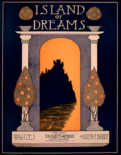
MODERN HALF-TONE TITLE PAGE |
COMBINATION IN LINE AND HALF-TONE |
Prior to the year 1900 scroll designs of black and white, with simple lettering, predominated. The different mediums of reproduction being lithography, steel engraving and printing from wood cuts. These methods have been supplanted by printing from zinc etchings and copper plates. Of the latter the now famous tricolor half-tone process represents the highest state of perfection that has yet been attained, it offering the designer who possesses a knowledge of color harmony extraordinary opportunities to produce effective results.
As a consequence of these modern innovations the title page of today is really an art print in which the dominant feature is, or should be, simplicity, for I have long claimed that however fanciful a design may be, and however many colors may be used in its printing, without simplicity it is utterly ineffective.
There are two distinct styles of title pages in general use, the "illustrated title," which should tell the story of the song, and the "decorative title," which depends solely upon its beauty of design and color scheme to attract attention. Either style of title, no matter how well executed, must possess simplicity in its design. Otherwise the use of color only tends to produce a complicated effect which is anything but effective, and oftentimes extremely unattractive. This fact became apparent to me in the early days of my career, and I was not slow to discover that the study of color effect was valuable not alone from an art standpoint, but from a practical printer's standpoint as well. Probably the hardest lesson that I ever mastered was that geniuses were "great" because of their wonderful simplicity, and it later became evident to me that simplicity was also a safe course, when I found I had to depend almost entirely on the printer and engraver for my finished product. This brings to mind the fact that the engraver plays no small part in the production of the title page, for without good plates it is utterly impossible to obtain satisfactory results, however skillful the printer may be.
And now to sum up. A simple design, perfect plates, a conscientious printer (if such exists), and you have the modern title page, which can trace its evolution through the marvelous progressive development of the printing and engraving arts of the last ten years. If the reader will but study the title page of the past and compare it with that of the present, he might well wonder what the future will bring forth.


 Loading Page. Please Wait...

 there was the word, and the word was with letters, and the letters constituted text, and the text identified the contents within. Then the publisher said "Let there be art," and it was so. And the public saw that it was good, and they said that it was good, and they bought it because they knew it was good.